Escape the Apocalypse - typeface choices
By Alex White
- 3 minutes read - 610 wordsWhile on the one hand thinking about typefaces and layout could be considered a bit premature when I've not started seriously writing up the rules yet, I've got my reasons.
Part of getting my head into the right space for these games means getting my feelings sorted out, and I'm a very visual kind of guy. That means that thinking about how things will look on the page is a valuable part of my process.
When it comes to typography, I think it is important that the body text is both legible and readable. I've seen some books with such fancy typefaces used for their body text that I could barely read them, and that's not right (unless you are wanting to win art awards or something!)
Title and heading fonts though - that is where I think there is room to be more adventurous and attempt to capture something of the atmosphere that is being intended for the game. I've been looking at three classes of typeface, and I thought it might be nice to show them here.
Distressed Writing
These are typefaces which look as though they have been worn away over time, and capture the sense of lack of maintenance and care. Things were once OK, but they have not been OK for a long while now.
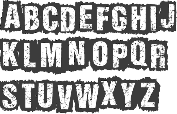
I really like the stencil effect of this one with the strong black background. It feels like the text would stand out well even if superimposed on other pictures.
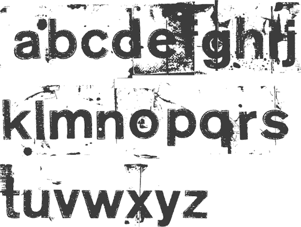
I’ve included this one because a lower case typeface is often easier to read, but I’m not sure that I can visualise where this would appear. What kind of signage gets distressed like this? Because I’m not sure, I think this one is for the ‘no’ pile.
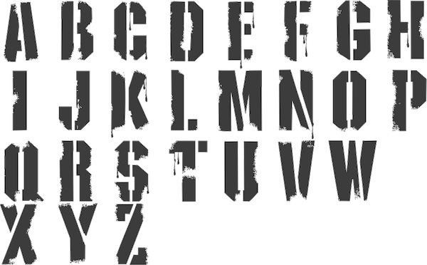
This looks like the classic military stencil, and could fit in well with any of the post-apocalyptic scenarios as it is easy to imagine military forces getting involved and putting up signposts. It isn’t highly distressed though, and so it might have a focus on the military rather than the post apocalypse that I want to capture?
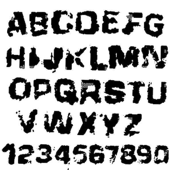
This typeface from Alamy looks highly distressed. Almost like someone has attempted to write with a sponge! It would be interesting to try out some of the titling with it, but I think it might end up being too black for my purposes.
Graffiti
These graffiti typefaces have the appearance of scrawled tags - informal signposts that might indicate of warnings ahead, or mark out territories of gangs in this forlorn future.

Urban Decay has a very spiky appearance, and maybe suggests danger or threat.

Sister Spray is a little more casual. Perhaps this is too relaxed for some hurried signs?

The random heights of the Misdemeanour font is appealing - rather than an official stencil it does feel like something that has been hurriedly applied by amateurs and that might work well for the kind of look I’m going for.
Dripping Paint
I quite like the idea of dripping paint - hastily scrawled warnings or notices. Not as stylised as graffiti, not as formal as military stencils. Someone leaving a message as best they can.

Probably my favourite of the dripping typefaces, A Dripping Marker has both upper and lower case which aids readability and has drips well spaced on both top and bottom of some of the letter forms.
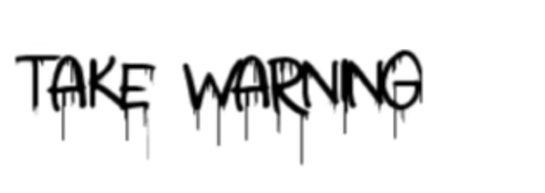
Another quite nice example of dripping paint, although Take Warning is all upper case, which I prefer to avoid.

This one is too regular and stylised. It isn’t really leaning into the dripping paint idea, it just has a couple of decorative drips on initial letters.